New UI-布局之LinearLayout(線性布局)詳解
來源:程序員人生 發布時間:2015-01-13 08:46:45 閱讀次數:4163次
New UI-布局之LinearLayout(線性布局)詳解
――轉載請注明出處:coder-pig,歡迎轉載,請勿用于商業用處!
小豬Android開發交換群已建立,歡迎大家加入,不管是新手,菜鳥,大神都可以,小豬1個人的
氣力畢竟是有限的,寫出來的東西肯定會有很多紕漏不足,歡迎大家指出,群策群力,讓小豬的博文
更加的詳實,幫到更多的人,O(∩_∩)O謝謝!
小豬Android開發交換群:小豬Android開發交換群群號:421858269
新Android UI實例大全目錄:http://blog.csdn.net/coder_pig/article/details/42145907
本節引言:
Android中的布局分為6大布局,分別是:
LinearLayout(線性布局),RelativeLayout(相對布局),TableLayout(表格布局)
FrameLayout(幀布局),AbsoluteLayout(絕對布局),GridLayout(網格布局)
而今天我們要講授的就是第1個布局,LinearLayout(線性布局),我們屏幕適配的使用
用的比較多的就是LinearLayout的weight(權重屬性),在這1節里,我們會詳細地解析
下LinearLayout,包括1些基本的屬性,Weight屬性的使用,和比例如何計算,另外還
會說下1個用的比較少的屬性:android:divider繪制下劃線
本節學習圖:
2.weight(權重)屬性
①最簡單用法:
如圖:
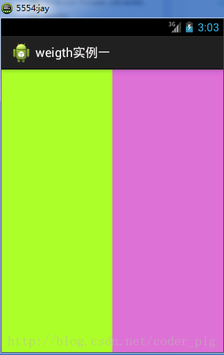
實現代碼:
<LinearLayout xmlns:android="http://schemas.android.com/apk/res/android"
xmlns:tools="http://schemas.android.com/tools"
android:id="@+id/LinearLayout1"
android:layout_width="match_parent"
android:layout_height="match_parent"
android:orientation="horizontal"
>
<LinearLayout
android:layout_width="0dp"
android:layout_height="fill_parent"
android:background="#ADFF2F"
android:layout_weight="1"/>
<LinearLayout
android:layout_width="0dp"
android:layout_height="fill_parent"
android:background="#DA70D6"
android:layout_weight="2"/>
</LinearLayout>
要實現第1個的1:1的效果,只需要分別把兩個LinearLayout的weight改成1和1就能夠了
用法歸納:
按比例劃分水平方向:將觸及到的View的android:width屬性設置為0dp,然后設置為android
weight屬性設置比例便可;類推,豎直方向,只需設android:height為0dp,然后設weight屬性便可!
大家可以自己寫個豎直方向的等比例劃分的體驗下簡單用法!
②weight屬性詳解:
固然,如果我們不適用上述那種設置為0dp的方式,直接用wrap_content和match_parent的話,
則要接著解析weight屬性了,分為兩種情況,wrap_content與match_parent!另外還要看
LinearLayout的orientation是水平還是豎直,這個決定哪一個方向等比例劃分
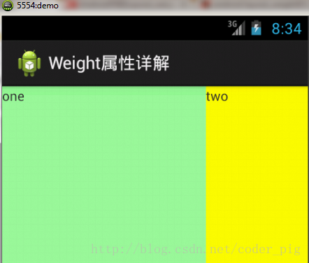
1)wrap_content比較簡單,直接就按比例的了
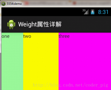
實現代碼:
<LinearLayout xmlns:android="http://schemas.android.com/apk/res/android"
xmlns:tools="http://schemas.android.com/tools"
android:id="@+id/LinearLayout1"
android:layout_width="match_parent"
android:layout_height="match_parent"
android:orientation="horizontal" >
<TextView
android:layout_weight="1"
android:layout_width="wrap_content"
android:layout_height="fill_parent"
android:text="one"
android:background="#98FB98"
/>
<TextView
android:layout_weight="2"
android:layout_width="wrap_content"
android:layout_height="fill_parent"
android:text="two"
android:background="#FFFF00"
/>
<TextView
android:layout_weight="3"
android:layout_width="wrap_content"
android:layout_height="fill_parent"
android:text="three"
android:background="#FF00FF"
/>
</LinearLayout>
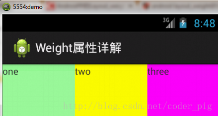
2)match_parent(fill_parent):這個責需要計算了
我們寫這段簡單的代碼:
<LinearLayout xmlns:android="http://schemas.android.com/apk/res/android"
xmlns:tools="http://schemas.android.com/tools"
android:id="@+id/LinearLayout1"
android:layout_width="match_parent"
android:layout_height="match_parent" >
<TextView
android:layout_weight="1"
android:layout_width="fill_parent"
android:layout_height="fill_parent"
android:text="one"
android:background="#98FB98"
/>
<TextView
android:layout_weight="2"
android:layout_width="fill_parent"
android:layout_height="fill_parent"
android:text="two"
android:background="#FFFF00"
/>
<TextView
android:layout_weight="3"
android:layout_width="fill_parent"
android:layout_height="fill_parent"
android:text="three"
android:background="#FF00FF"
/>
</LinearLayout>
運行效果圖:
這個時候就會有疑問了,怎樣會這樣,這比例是2:1吧,那末three去哪了?代碼里面明明有
three的啊,還設置了3的,而1和2的比例也不對耶,1:2:3卻變成了2:1:0,怎樣會這樣呢?
答:這里其實沒那末簡單的,還是需要我們計算的,網上給出的算法有幾種,這里就給出筆者
覺得比較容易理解的1種:
step 1:個個都是fill_parent,但是屏幕只有1個啦,那末1 - 3 = - 2 fill_parent
step 2:順次比例是1/6,2/6,3/6
step 3:先到先得,先分給one,計算: 1 - 2 * (1/6) = 2/3 fill_parent
接著到two,計算: 1 - 2 * (2/6) = 1/3 fill_parent
最后到three,計算 1 - 2 * (3/6) = 0 fill_parent
step 4:所以最后的結果是:one占了兩份,two占了1份,three甚么都木有
以上就是為何three沒有出現的緣由了,也許大家看完還是有點蒙,沒事,我們舉多幾個
例子就知道了:
比例為:1:1:1
依照上面的計算方法算1次,結果是:1/3 1/3 1/3,沒錯
接著我們再試下:2:3:4
計算結果:5/9 3/9 1/9,對照效果圖,5:3:1,也沒錯,所以這個計算方法你可得mark下了!
③Java代碼設置weight屬性:
setLayoutParams(new LayoutParams(LayoutParams.FILL_PARENT,
LayoutParams.WRAP_CONTENT, 1));
3.為LinearLayout設置分割線
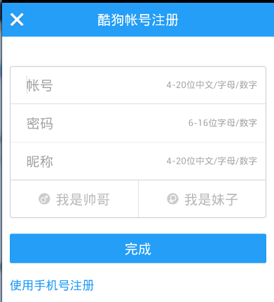
很多界面開發中都會設置1些下劃線,或分割線,從而使得界面更加整潔美觀,比以下面的酷狗
音樂的注冊頁面:
對這類線,我們通常的做法有兩種
①直接在布局中添加1個view,這個view的作用僅僅是顯示出1條線,代碼也很簡單:
<View
android:layout_width="match_parent"
android:layout_height="1px"
android:background="#000000" />
這個是水平方向上的黑線,固然你也能夠改成其他色彩,或使用圖片
②第2種則是使用LinearLayout的1個divider屬性,直接為LinearLayout設置分割線
這里就需要你自己準備1張 線的圖片了
1)android:divider設置作為分割線的圖片
2)android:showDividers設置分割線的位置,none(無),begining(開始),end(結束),middle(每兩個組件間)
3)dividerPadding設置分割線的Padding
使用示例:
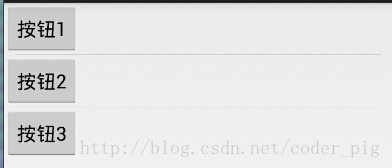
實現代碼:
<LinearLayout xmlns:android="http://schemas.android.com/apk/res/android"
xmlns:tools="http://schemas.android.com/tools"
android:id="@+id/LinearLayout1"
android:layout_width="match_parent"
android:layout_height="match_parent"
android:divider="@drawable/ktv_line_div"
android:orientation="vertical"
android:showDividers="middle"
android:dividerPadding="10dp"
tools:context="com.jay.example.linearlayoutdemo.MainActivity" >
<Button
android:layout_width="wrap_content"
android:layout_height="wrap_content"
android:text="按鈕1" />
<Button
android:layout_width="wrap_content"
android:layout_height="wrap_content"
android:text="按鈕2" />
<Button
android:layout_width="wrap_content"
android:layout_height="wrap_content"
android:text="按鈕3" />
</LinearLayout>
上述代碼中我們設置了分割線的圖片,和設置分割線的出現位置,和設置了padding,就實現了上面的效果!
固然我們也能夠在代碼中setXxx或getXxx設置或取得這些屬性的值
4.LinearLayout的簡單例子:
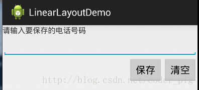
實現代碼以下:
<LinearLayout xmlns:android="http://schemas.android.com/apk/res/android"
xmlns:tools="http://schemas.android.com/tools"
android:id="@+id/LinearLayout1"
android:layout_width="fill_parent"
android:layout_height="fill_parent"
android:orientation="vertical"
tools:context=".MainActivity" >
<TextView
android:layout_width="wrap_content"
android:layout_height="wrap_content"
android:text="請輸入要保存的電話號碼"
/>
<EditText
android:layout_width="fill_parent"
android:layout_height="wrap_content"
/>
<LinearLayout
android:layout_width="fill_parent"
android:layout_height="wrap_content"
android:orientation="horizontal"
android:gravity="right"
>
<Button
android:layout_width="wrap_content"
android:layout_height="wrap_content"
android:text="保存"
/>
<Button
android:layout_width="wrap_content"
android:layout_height="wrap_content"
android:text="清空"
/>
</LinearLayout>
</LinearLayout>
5.注意事項:
使用Layout_gravity的1個很重要的問題!!!
這個問題是1個讀者偶爾1次發現反饋給我的,萬分感謝,同時希望大家在看小豬博客的時候可以提出
1些實際開發中遇到的問題,和解決方式,好給后來者經驗!畢竟小豬不是神,不是甚么各個方面都能
斟酌到的,謝謝!
問題內容:
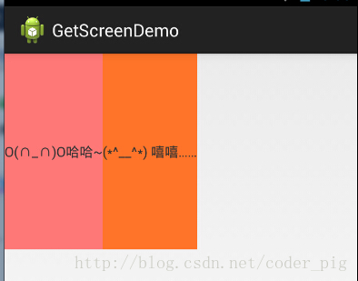
在1個LinearLayout的水平方向中布置兩個TextView,想讓1個左,1個右,怎樣弄?
也許你會脫口而出:"gravity設置1個left,1個right就能夠啦!"
真的這么簡單?你試過嗎?寫個簡單的Layout你就會發現,適得其反了:
-
<LinearLayout xmlns:android="http://schemas.android.com/apk/res/android"
-
xmlns:tools="http://schemas.android.com/tools"
-
android:layout_width="match_parent"
-
android:layout_height="match_parent"
-
android:orientation="horizontal"
-
tools:context="com.jay.example.getscreendemo.MainActivity" >
-
-
<TextView
-
android:layout_width="wrap_content"
-
android:layout_height="200dp"
-
android:layout_gravity="left"
-
android:background="#FF7878"
-
android:gravity="center"
-
android:text="O(∩_∩)O哈哈~" />
-
-
<TextView
-
android:layout_width="wrap_content"
-
android:layout_height="200dp"
-
android:layout_gravity="right"
-
android:background="#FF7428"
-
android:gravity="center"
-
android:text="(*^__^*) 嘻嘻……" />
-
-
</LinearLayout>
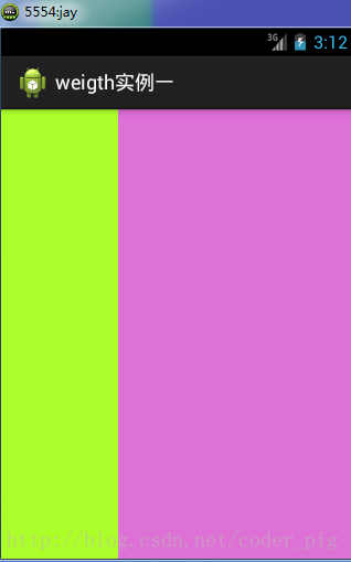
運行結果圖:
看到這里你會說:哎呀,真的不行耶,要不在外層LinearLayout加個gravity=left的屬性,然后設置第2個
TextView的layout_gravity為right,恩,好我們試1下:
-
<LinearLayout xmlns:android="http://schemas.android.com/apk/res/android"
-
xmlns:tools="http://schemas.android.com/tools"
-
android:layout_width="match_parent"
-
android:layout_height="match_parent"
-
android:orientation="horizontal"
-
android:gravity="left"
-
tools:context="com.jay.example.getscreendemo.MainActivity" >
-
-
<TextView
-
android:layout_width="wrap_content"
-
android:layout_height="200dp"
-
android:background="#FF7878"
-
android:gravity="center"
-
android:text="O(∩_∩)O哈哈~" />
-
-
<TextView
-
android:layout_width="wrap_content"
-
android:layout_height="200dp"
-
&
生活不易,碼農辛苦
如果您覺得本網站對您的學習有所幫助,可以手機掃描二維碼進行捐贈

------分隔線----------------------------
------分隔線----------------------------


