
谷歌官方推出Material Design 設計理念已有段時間了,為支持更方便的實現
Material Design設計效果,官方給出了Android support design library 支持庫,讓開發者更容易的實現材料設計的效果。順便推薦官方的1個圖標庫:Material Icons
| 控件名稱 |
|---|
| NavigationView |
| FloatingActionButton |
| TextInputLayout |
| Snackbar |
| TabLayout |
| AppBarLayout |
| CoordinatorLayout |
| CollapsingToolbarLayout |
| Coordinator.Behavior |
| BottomSheet |
| BottomSheetDialog |
以上請參閱:Android support library支持包經常使用控件介紹(1)
| 控件名稱 |
|---|
| Bottom Sheet |
以下控件為v7包中
| 控件名稱 |
|---|
| RecyclerView |
| CardView |
| palette |
以下控件為v4包中
| 控件名稱 |
|---|
| DrawerLayout |
| SwipeRefreshLayout |
*
Bottom Sheets控件,1個底部表,就是我們常常在分享或地圖、音樂等app看到的效果。

下面說下具體實現:
布局文件:
<?xml version="1.0" encoding="utf⑻"?>
<android.support.design.widget.CoordinatorLayout
    xmlns:android="http://schemas.android.com/apk/res/android"
    xmlns:app="http://schemas.android.com/apk/res-auto"
    android:id="@+id/cl"
    android:layout_width="match_parent"
    android:layout_height="match_parent"
    android:fitsSystemWindows="true"
    >

    <android.support.v4.widget.NestedScrollView
        android:id="@+id/bottom_sheet"
        android:layout_width="match_parent"
        android:layout_height="wrap_content"
        app:behavior_hideable="true"
        app:behavior_peekHeight="50dp"
        app:layout_behavior="@string/bottom_sheet_behavior"
        >
        <!-- NestedScrollView里設置你的底部表長甚么樣的-->

        <LinearLayout
            android:layout_width="match_parent"
            android:layout_height="50dp"
            android:orientation="vertical">

            <TextView
                android:id="@+id/tv"
                android:layout_width="match_parent"
                android:layout_height="50dp"
                android:background="?attr/colorAccent"
                android:gravity="center"
                android:text="點擊 或 拖動我"
                android:textColor="@android:color/white"/>

            <ImageView
                android:layout_width="match_parent"
                android:layout_height="wrap_content"
                android:scaleType="centerCrop"
                android:layout_margin="10dp"
                android:src="@drawable/header"/>

            <ImageView
                android:layout_marginRight="10dp"
                android:layout_marginLeft="10dp"
                android:layout_width="match_parent"
                android:layout_height="wrap_content"
                android:scaleType="centerCrop"
                android:src="@drawable/header"/>

        </LinearLayout>


    </android.support.v4.widget.NestedScrollView>
</android.support.design.widget.CoordinatorLayout>
java代碼:
 // The View with the BottomSheetBehavior
        CoordinatorLayout coordinatorLayout = (CoordinatorLayout) findViewById(R.id.cl);
        View bottomSheet = coordinatorLayout.findViewById(R.id.bottom_sheet);
        final BottomSheetBehavior behavior = BottomSheetBehavior.from(bottomSheet);
        behavior.setBottomSheetCallback(new BottomSheetBehavior.BottomSheetCallback() {
            @Override
            public void onStateChanged(@NonNull View bottomSheet, int newState) {
                //這里是bottomSheet 狀態的改變,根據slideOffset可以做1些動畫
                Log.i("TAG", "newState--->" + newState);
//                ViewCompat.setScaleX(bottomSheet,1);
//                ViewCompat.setScaleY(bottomSheet,1);
            }

            @Override
            public void onSlide(@NonNull View bottomSheet, float slideOffset) {
                //這里是拖拽中的回調,根據slideOffset可以做1些動畫
                Log.i("TAG", "slideOffset=====》" + slideOffset);

            }
        });

        findViewById(R.id.tv).setOnClickListener(new View.OnClickListener() {
            @Override
            public void onClick(View v) {
                if (behavior.getState() == BottomSheetBehavior.STATE_COLLAPSED) {
                    behavior.setState(BottomSheetBehavior.STATE_EXPANDED);
                } else {
                    behavior.setState(BottomSheetBehavior.STATE_COLLAPSED);
                }
            }
        });
通過附加1個BottomSheetBehavior 給CoordinatorLayout的子視圖,上文xml中的是NestedScrollView(adding app:layout_behavior = ” android.support.design.widget.BottomSheetBehavior”),固然,RecyclerView也是可以的。
peekHeight是當Bottom Sheets關閉的時候,底部下表我們能看到的高度,hideable 是當我們拖拽下拉的時候,bottom sheet是不是能全部隱藏。 如果你需要監聽Bottom Sheets回調的狀態,可以通過setBottomSheetCallback來實現,onSlide方法是拖拽中的回調,根據slideOffset可以做1些動畫 onStateChanged方法可以監聽到狀態的改變,總共有5種:
STATE_COLLAPSED: 關閉Bottom Sheets,顯示peekHeight的高度,默許是0
compile ‘com.android.support:appcompat-v7:23.2.1’
RecylerView是support-v7包中的新組件,是1個強大的滑動組件,與經典的ListView相比,一樣具有item回光復用的功能,這1點從它的名字recylerview即回收view也能夠看出。
recyclerView = (RecyclerView) findViewById(R.id.recyclerView);
LinearLayoutManager layoutManager = new LinearLayoutManager(this );
//設置布局管理器
recyclerView.setLayoutManager(layoutManager);
//設置為垂直布局,這也是默許的
layoutManager.setOrientation(OrientationHelper. VERTICAL);
//設置Adapter
recyclerView.setAdapter( recycleAdapter);
//設置分隔線
recyclerView.addItemDecoration( new DividerGridItemDecoration(this ));
//設置增加或刪除條目的動畫
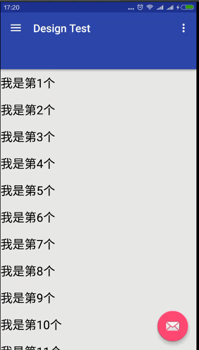
recyclerView.setItemAnimator( new DefaultItemAnimator());現在說下RecyclerView的經常使用操作,強烈推薦使用RecyclerView替換ListView。
    private RecyclerView recyclerView;
    private MyrecycleAdapter recycleAdapter;


    List<String> mData = new ArrayList<>();
        for (int i = 0;i<50;i++){
            mData.add("我是第"+(i+1)+"個");
        }
        recycleAdapter = new MyrecycleAdapter(mData);
        recyclerView = (RecyclerView) findViewById(R.id.rcyl_view);
        LinearLayoutManager layoutManager = new LinearLayoutManager(this );
        //設置布局管理器
        recyclerView.setLayoutManager(layoutManager);
        //設置為垂直布局,這也是默許的
        layoutManager.setOrientation(OrientationHelper.VERTICAL);
        //設置Adapter
        recyclerView.setAdapter(recycleAdapter);
adapter:
 class MyrecycleAdapter extends RecyclerView.Adapter<MyrecycleAdapter.MyViewHolder>{

        List<String> mData = new ArrayList<>();
        public MyrecycleAdapter(List<String> mData){
            this.mData = mData;
        }

        @Override
        public MyViewHolder onCreateViewHolder(ViewGroup parent, int viewType) {

            View view = View.inflate(parent.getContext(),R.layout.item_view,null);
            MyViewHolder holder= new MyViewHolder(view);
            return holder;

        }

        @Override
        public void onBindViewHolder(MyViewHolder holder, int position) {

            holder.tv.setText(mData.get(position));
        }

        @Override
        public int getItemCount() {

            return mData.size();
        }
         class MyViewHolder extends RecyclerView.ViewHolder{

             TextView tv;
             public MyViewHolder(View itemView) {
                 super(itemView);
                 tv = (TextView) itemView.findViewById(R.id.tv);
             }

         }
    }
xml:
<?xml version="1.0" encoding="utf⑻"?>
<android.support.v7.widget.RecyclerView xmlns:android="http://schemas.android.com/apk/res/android"
    xmlns:app="http://schemas.android.com/apk/res-auto"
    android:orientation="vertical" android:layout_width="match_parent"
    app:layout_behavior="@string/appbar_scrolling_view_behavior"
    android:scrollbarAlwaysDrawVerticalTrack="true"
    android:id="@+id/rcyl_view"
    android:layout_height="match_parent"/>
item_view.xml:
<?xml version="1.0" encoding="utf⑻"?>
<TextView  xmlns:android="http://schemas.android.com/apk/res/android"
        android:layout_width="match_parent"
        android:layout_height="40dp"
        android:id="@+id/tv"
        android:textSize="22sp"
        android:textColor="#000"
        android:paddingTop="10dp"
        android:paddingBottom="10dp"
        android:gravity="center"/>
RecyclerView.Adapter,需要實現3個方法:
這里只是介紹下RecyclerView的基本經常使用操作,具體細節請參照博客:
* http://blog.csdn.net/lmj623565791/article/details/45059587
compile ‘com.android.support:appcompat-v7:23.2.1’
google自己推出的下拉刷新組件SwipeRefreshLayout。
沿用RecycleView的例子:
<?xml version="1.0" encoding="utf⑻"?>
<android.support.v4.widget.SwipeRefreshLayout xmlns:android="http://schemas.android.com/apk/res/android"
xmlns:app="http://schemas.android.com/apk/res-auto"
app:layout_behavior="@string/appbar_scrolling_view_behavior"
android:layout_height="match_parent"
android:id="@+id/swipe_container"
android:layout_width="match_parent">
<android.support.v7.widget.RecyclerView
android:orientation="vertical"
android:scrollbarAlwaysDrawVerticalTrack="true"
android:id="@+id/rcyl_view"
android:layout_height="match_parent"
android:layout_width="match_parent"/>
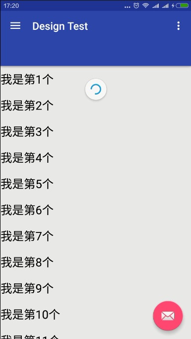
</android.support.v4.widget.SwipeRefreshLayout>final SwipeRefreshLayout swipeRefreshLayout = (SwipeRefreshLayout)findViewById(R.id.swipe_container);
//設置刷新時動畫的色彩,可以設置4個
swipeRefreshLayout.setColorSchemeResources(android.R.color.holo_blue_light, android.R.color.holo_red_light, android.R.color.holo_orange_light, android.R.color.holo_green_light);
swipeRefreshLayout.setOnRefreshListener(new SwipeRefreshLayout.OnRefreshListener() {
@Override
public void onRefresh() {
recyclerView.postDelayed(new Runnable() {
@Override
public void run() {
mData.add(0,"aaaa");
mData.add(0,"aaaa");
mData.add(0, "aaaa");
recycleAdapter.notifyDataSetChanged();
swipeRefreshLayout.setRefreshing(false);
}
},2000);
}
});除OnRefreshListener接口外,SwipRefreshLayout中還有1些其他重要的方法,具體以下:
    1、setOnRefreshListener(SwipeRefreshLayout.OnRefreshListener listener):設置手勢滑動監聽器。

     2、setProgressBackgroundColor(int colorRes):設置進度圈的背風景。

     3、setColorSchemeResources(int… colorResIds):設置進度動畫的色彩。

     4、setRefreshing(Boolean refreshing):設置組件的洗擦狀態。

     5、setSize(int size):設置進度圈的大小,只有兩個值:DEFAULT、LARGE
compile ‘com.android.support:appcompat-v7:23.2.1’
CardView繼承至FrameLayout類,可以在1個卡片布局中1致性的顯示內容,卡片可以包括圓角和陰影。常常在ListView和RecyclerView的Item布局中,作為1種容器使用。
CardView 提供了1個默許的elevation,也就是Z軸的陰影。和圓角角度,每個卡片都能夠在不同的裝備上保持相同的外觀。
<android.support.v7.widget.CardView xmlns:android="http://schemas.android.com/apk/res/android"
    xmlns:card_view="http://schemas.android.com/apk/res-auto"
    android:orientation="vertical" android:layout_width="match_parent"
    android:layout_height="wrap_content"
    card_view:cardCornerRadius="8dp"
    card_view:cardElevation="8dp">

<!-- Content View-->

</android.support.v7.widget.CardView>
1.增加波紋點擊效果
//添加以下屬性
 android:clickable="true"
 android:foreground="?android:attr/selectableItemBackground"
使用android:foreground=”?android:attr/selectableItemBackground”可使CardView點擊產生波紋效果,由觸點向外分散。目前測試僅在5.0以后系統有效。
2.保持兼容性(對更早版本的支持)
在Android L 之前的裝備上,CardView為了支持圓角效果加上了padding。對陰影效果來講,在Android L 之前,也會提供padding去繪制陰影面積,這些內容的padding是和elevation的屬性相干的:
padding的值:
如果你想要給自己的內容加上padding的話,需使用新屬性:
card_view:contentPadding
注意:
關于Android 5.0以上使用v7包的CardView沒有陰影效果的問題。在CardView添加以下屬性便可:
    card_view:cardPreventCornerOverlap="true"
card_view:cardUseCompatPadding="true"Palette類是Android5.0引進來的1個獲得Bitmap色彩值的類。也在v7 Library包中。
// 用來提取色彩的Bitmap
        Bitmap bitmap = BitmapFactory.decodeResource(getResources(),
                SuperAwesomeCardFragment.getBackgroundBitmapPosition(position));
        // Palette的部份 同步
        Palette.generateAsync(bitmap, new Palette.PaletteAsyncListener() {
            /**
             * 提取完以后的回調方法
             */
            @Override
            public void onGenerated(Palette palette) {
                Palette.Swatch vibrant = palette.getVibrantSwatch();

            }
        });
        //異步
        Palette.from(bitmap).generate(new Palette.PaletteAsyncListener(){
        @Override
            public void onGenerated(Palette palette) {
                Palette.Swatch vibrant = palette.getVibrantSwatch();//有活力
                if(vibrant != null){
                    //vibrant.getRgb();
                    //vibrant.getTitleTextColor
                }

            }

        })
工具方法:
/**
     * 色彩加深處理
     *
     * @param RGBValues
     *            RGB的值,由alpha(透明度)、red(紅)、green(綠)、blue(藍)構成,
     *            Android中我們1般使用它的16進制,
     *            例如:"#FFAABBCC",最左側到最右每兩個字母就是代表alpha(透明度)、
     *            red(紅)、green(綠)、blue(藍)。每種色彩值占1個字節(8位),值域0~255
     *            所以下面使用移位的方法可以得到每種色彩的值,然后每種色彩值減小1下,在合成RGB色彩,色彩就會看起來深1些了
     * @return
     */
    private int colorBurn(int RGBValues) {
        int alpha = RGBValues >> 24;
        int red = RGBValues >> 16 & 0xFF;
        int green = RGBValues >> 8 & 0xFF;
        int blue = RGBValues & 0xFF;
        red = (int) Math.floor(red * (1 - 0.1));
        green = (int) Math.floor(green * (1 - 0.1));
        blue = (int) Math.floor(blue * (1 - 0.1));
        return Color.rgb(red, green, blue);
    }
對圖象的處理有多是耗時操作,因此Palette類取得的色彩通過onGenerated回調的方法來獲得。
Palette類取得的色彩值有以下幾種類型:
Palette.Swatch a =

palette.getVibrantSwatch();//有活力
palette.getDarkVibrantSwatch();//有活力  暗色
palette.getLightVibrantSwatch();//有活力 亮色
palette.getMutedSwatch();//柔和
palette.getDarkMutedSwatch();//柔和 暗色
palette.getLightMutedSwatch();//柔和 亮色

a.getBodyTextColor();//內容色彩
a.getTitleTextColor();//標題色彩
a.getRgb();//rgb色彩注:由于v7中包括v4包,故這里導入的v7.
<?xml version="1.0" encoding="utf⑻"?>
<android.support.v4.widget.DrawerLayout xmlns:android="http://schemas.android.com/apk/res/android"
xmlns:app="http://schemas.android.com/apk/res-auto"
xmlns:tools="http://schemas.android.com/tools"
android:id="@+id/drawer_layout"
android:layout_width="match_parent"
android:layout_height="match_parent"
android:fitsSystemWindows="true"
tools:openDrawer="start">
<!-- -->
<include
layout="@layout/app_bar_main"
android:layout_width="match_parent"
android:layout_height="match_parent" />
<android.support.design.widget.NavigationView
android:id="@+id/nav_view"
android:layout_width="wrap_content"
android:layout_height="match_parent"
android:layout_gravity="start"
android:fitsSystemWindows="true"
app:headerLayout="@layout/nav_header_main"
app:menu="@menu/activity_main_drawer" />
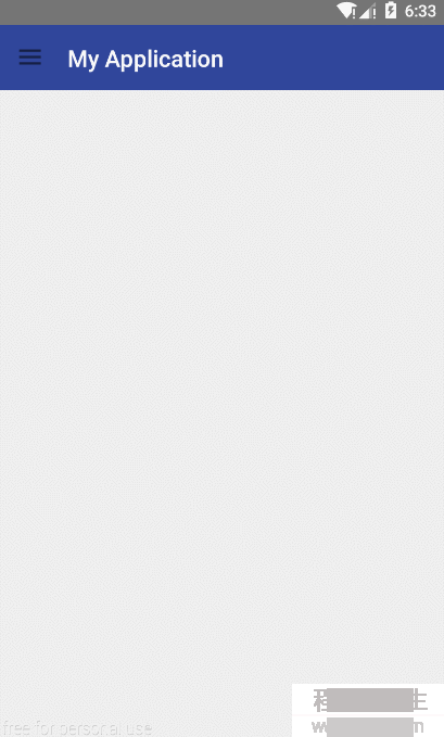
</android.support.v4.widget.DrawerLayout>app_bar_main.xml:
<?xml version="1.0" encoding="utf⑻"?>
<android.support.design.widget.CoordinatorLayout xmlns:android="http://schemas.android.com/apk/res/android"
    xmlns:app="http://schemas.android.com/apk/res-auto"
    xmlns:tools="http://schemas.android.com/tools"
    android:layout_width="match_parent"
    android:layout_height="match_parent"
    tools:context="com.tf.globalapplication.MainActivity">

    <android.support.design.widget.AppBarLayout
        android:layout_width="match_parent"
        android:layout_height="wrap_content"
        android:theme="@style/AppTheme.AppBarOverlay">

        <android.support.v7.widget.Toolbar
            android:id="@+id/toolbar"
            android:layout_width="match_parent"
            android:layout_height="?attr/actionBarSize"
            android:background="?attr/colorPrimary"
            app:popupTheme="@style/AppTheme.PopupOverlay"
            app:layout_scrollFlags="scroll|enterAlways" />
        <android.support.design.widget.TabLayout
            android:id="@+id/tabs"
            android:layout_width="match_parent"
            android:layout_height="wrap_content" />

    </android.support.design.widget.AppBarLayout>

    <include layout="@layout/content_main" />

    <android.support.design.widget.FloatingActionButton
        android:id="@+id/fab"
        android:layout_width="wrap_content"
        android:layout_height="wrap_content"
        android:layout_gravity="bottom|end"
        android:layout_margin="@dimen/fab_margin"
        android:src="@android:drawable/ic_dialog_email" />

</android.support.design.widget.CoordinatorLayout>
java:
 Toolbar toolbar = (Toolbar) findViewById(R.id.toolbar);
 setSupportActionBar(toolbar);

 DrawerLayout drawer = (DrawerLayout) findViewById(R.id.drawer_layout);
        ActionBarDrawerToggle toggle = new ActionBarDrawerToggle(
                this, drawer, toolbar, R.string.navigation_drawer_open, R.string.navigation_drawer_close);
        //drawer.setDrawerListener(toggle);
        drawer.addDrawerListener(toggle);
        toggle.syncState();
程序員人生,我編程,我富裕,記住wfuyu網,php教程,php學習,php手冊,CMS模版制作
聲明:本站大部分內容是作者原創,少部分收集于互聯網供大家一起學習,原版權很多不明,如有侵權請聯系本站,謝謝!
粵ICP備14040726號-1?? 2015-2020 程序員人生 版權所有


